
Nothing refreshes your brand like a new typeface. Just ask Google® , who revamped their logo in September of last year. Changing around the fonts associated with your branding will revitalize your look and lend a new on-trend to your brand for the new year. Typography trends move quickly though, and for folks who aren’t deep in the design world, it can be tough to keep track of what’s in and out of fashion.
![]()
Choosing a font that not only clearly conveys your message, but also promotes your brand’s sense of style and design in print and online is tough. Unfortunately, fonts that look great on the web don’t always translate well to print. While you may not notice it in your day to day reading, web fonts are designed to enhance readability on backlit digital screens and will interact with your eye differently than fonts designed for the printed page. How are they different?
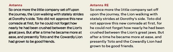
Web fonts can feature a taller x-height (or reduced ascenders and descenders), wider letterforms, more open counters, heavier thin strokes and serifs, reduced stroke contrast, as well as modified curves and angles for some designs according to Ilene Strizver, a typographic consultant and the founder of The Type Studio. Her article for CreativePro® features a series of wonderful examples showing the small differences made to optimize familiar typefaces for the web. With the use of two font types (ITC Gallard and Antenna), she clearly demonstrates how the styling of web fonts is bolder, has more accentuated features, and is spaced wider compared to its print counterpart. Fonts that are spaced widely can look sparse on the printed page but optimal on the screen. The same factors apply when using multiple fonts in headlines, subheads, and text body.
Choosing a font that will come across beautifully on your website as well as on your flyers, marketing decks, and business cards isn’t impossible—in fact, it helps solidify your branding in both the digital and physical world.
So with all that established, let’s talk about what’s hot for 2016. Sure, there are thousands of free fonts available from hosting services such as Typekit® and of course Google Fonts, but where do you even get started? Justin Radomski at Southern Web writes that geometry will be important for typography this year, as illustrated by the strong rounded forms in the new Google logo. Font boldness seems to be really coming into fashion judging from the choices made by several prominent typography aficionados. This is good news for designers looking to cross web and print branding, as the richness of many rounded geometric typefaces translate well to both black and color print.
Here are a few of my personal favorites for 2016:
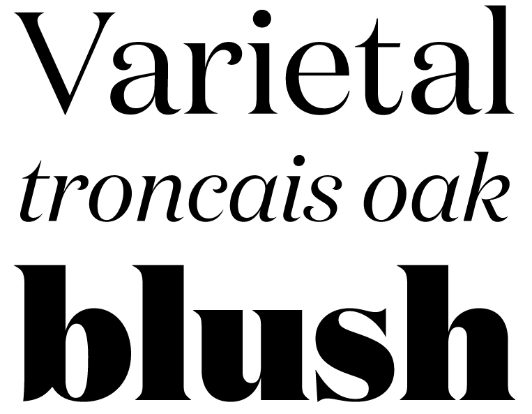
Domain. Designed by New Zealand-based designer Kris Sowersby, Domain features little flourishes that make it great for web design. The display version of Domain Jeremiah Shoaf at Typewolf writes, “is more flamboyant than the text version, with higher contrast and more prominent hook terminals.” While the thick rich shapes of this display font are designed for web use, it transfers cleanly to headline print thanks to a tight letter spacing and ligatures. I love the geometric intrigue presented in the curved accents, especially on the lowercase text lettering.
Tiempos Text. Eric Arruda at Monotype writes on CreativeBloq that 2016 will be a big year for serifs. Those tiny little accents on the ends of letters are coming into popularity once again, thanks in part to technological advances in digital displays that make them clean and easy to read. For fans of Garamond who are looking for a bigger statement, I like Tiempos Text. Designed for the web for a Spanish newspaper, it combines classic sophistication with a tech-friendly boldness.
Apercu. Typewolf’s Jeremiah Shoaf writes over at Smashing Magazine that Apercu is among the trendiest fonts out there right now. It’s easy to see why . . . it’s clean, modern, and understated in its sophistication. For Helvetica and Futura lovers looking to stand out, Apercu is a great alternative that, while popular, isn’t so omnipresent as to sacrifice its uniqueness and personality.
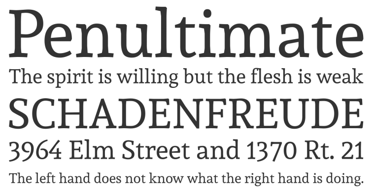
Andada. Designed by Carolina Giovagnoli for Huerta Tipografica, Andada font is a traditional slab serif with a beautiful organic look and feel. Perhaps my favorite part about this font is the character it develops as it you choose a larger typeface size—the larger the letter, the more you begin to notice the thickness variances and sizing of each letter. This uniqueness is something that translates well both to high-definition digital screens and high grade print.
Remember above all that choosing a new typeface for your website should be a labor of love. Choosing a great typeface that transitions smoothly between your web and print marketing presence is ideal for promoting uniformity in your message, which leads to customers associating a look with your brand evenly and consistently.


Leave a Reply